Brand style guide · 2026
The Nail’d It!
Look Book.
How the brand looks, sounds, and glows. Everything here is pulled straight from the live storefront, so anything new (a page, a post, a label, a slide) can match it.
Brand Voice
Bold, expressive, a little rebellious. Nail’d It! is hand-painted press-on nail art for people who want a statement, not a neutral. The target customer is 18 to 30, finds us on Instagram and TikTok, and loves hand-painted florals, chrome finishes, and bold color.
Say it in a breath.
Headlines are three to six words. Body copy is one or two sentences. If it needs a scroll, cut it.
No hedging.
“Impossible to ignore,” not “might turn some heads.” We believe in the sets, so the copy does too.
Wink, don’t shout.
Puns and attitude are welcome (“0 boring details,” “Good Excuses”), but the product stays the hero.
Logos & Neon Marks
The wordmark is the primary logo. The neon hand marks are supporting illustrations, one per section, never two side by side. Every mark gets the same logo glow (see Glow) and always sits on a dark or brick background.
Wordmark
Header and footer. Minimum 100px wide.
App icon
Favicon, social avatar, packaging seal.
Polish duo
Tilted −17° over the hero image.
Skeleton hand
Ritual and how-to content.
Disco nails
Collections and mood content.
Heart nails
New drops and product grids.
Moon nails
Custom orders and made-to-order.
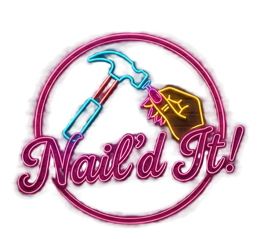
Round badge
Stickers, packaging, social posts.
Color Palette
Five neons on void black. Pink leads; cyan, violet, and yellow support. Neons are for text, borders, and glow, not large flat fills. The only big fills are the pink-to-violet button gradient and the plum band.
#ff3295 --pinkPrimary. Glow color for script, card and logo halos.
#ffacd6 --pink-lightScript headlines, prices, first marquee style.
#27e7f5 --cyanEyebrows, focus rings, hover borders.
#9255ff --violetSecondary glow, section borders, Poppins labels.
#ffd34e --yellow✦ sparkles, price pills, script links, button text.
#000000#0d0e12#141522#faf6ff#b2b7ca#b71966 → #8528a0Primary buttons and round arrow controls.
pink → violet → cyanHeader underline and progress bars.
#8a205bProduct badges (“Hand-painted”, “New drop”).
Typography
Four Google Fonts. Plus Jakarta Sans does the heavy lifting; Sacramento is the neon sign. Bebas Neue and Poppins appear in labels and buttons, rotating with the other two like the marquee.
Hand-painted press-ons for every version of you, from soft and understated to impossible to ignore.
Press on. Stand out.
| Role | Size | Font |
|---|---|---|
| Hero title | clamp(54px, 7vw, 104px) | Jakarta 900 + Sacramento emphasis |
| Section title | clamp(42px, 5vw, 72px) | Jakarta 900 + Sacramento emphasis |
| Card title | 15 to 26px | Jakarta 700 to 800 |
| Body | 14 to 15px, line-height 1.75 to 1.8 | Jakarta 400, muted color |
| Small label | 10 to 11px, uppercase | Jakarta 800, cyan |
Load all four with one Google Fonts link: family=Sacramento&family=Plus+Jakarta+Sans:wght@400;500;600;700;800&family=Bebas+Neue&family=Poppins:wght@700;800. This replaces the Inter and Alex Brush pairing in the older internal guide.
The Glow
Glow is the signature, and it is kept consistent: one text glow, one card glow, one logo glow. Script text breathes on a slow 3.2s pulse; marquee items pulse at 2.4s in their own color.
--text-glow-pink: 3, 10, 22, 40px pink layers with a white core. Animated with pink-neon-glow.
Text shadow in currentColor at 4, 10, 20px, pulsing via ticker-glow. Used in nav, marquee, and chips.
--card-glow: dark drop shadow plus 16px pink and 36px violet halos, pink border at 40%.
--logo-glow: drop-shadow 8px pink + 20px violet. Grows a touch on hover.
12px pink and 26px violet halo with a 1px white inner highlight. Lifts 3px on hover.
Pink to violet to cyan gradient line under the header and on progress bars.
--text-glow-pink: 0 0 3px rgba(255,240,248,.85), 0 0 10px rgba(255,50,149,1), 0 0 22px rgba(255,50,149,.7), 0 0 40px rgba(255,50,149,.35)
--card-glow: 0 12px 28px rgba(0,0,0,.55), 0 0 16px rgba(255,50,149,.3), 0 0 36px rgba(146,85,255,.2)
--logo-glow: drop-shadow(0 0 8px rgba(255,50,149,.6)) drop-shadow(0 0 20px rgba(146,85,255,.4))
Buttons & Chips
Buttons and filter chips rotate through the four marquee styles (Jakarta pink, Bebas cyan, Poppins violet, Sacramento yellow) so a row never looks uniform. Corners are 12px on buttons and fully round on chips.
Primary: gradient #b71966 → #8528a0, pink-light border at 60%. Secondary: transparent with cyan border and cyan script text. Text link: Sacramento 30px in yellow with a yellow glow.
Chips: glow in their own color when active. Badges: berry fill for product labels, yellow outline for counts. Arrow controls: round, button gradient, yellow icon.
Backgrounds
The page is void black with faint violet light. Sections alternate between glitter black, brick wall, and pattern tile so scrolling has rhythm. Keep two plain sections between repeats of the same texture.
Page base: black with violet glow at top left and a whisper of cyan on the right.
Hero and ritual: tiny sparkles in all five neons, two layers twinkling out of step.
Header, custom orders, gallery. Darkened 30 to 50% so neon reads on top.
Marquee band and product grid, under a 55 to 78% black veil.
Launch-drop section: soft blooms of pink, cyan, violet, and yellow on near black.
Newsletter and contact: #3a193b → #171222 gradient with violet borders.
Do & Don’t
Do
- Put one Sacramento word in every big headline, and make it glow pink.
- Start every section with a cyan eyebrow.
- Use real product photos with the pink card border and glow.
- Rotate the four marquee styles across rows of links or buttons.
- Keep body copy muted gray so the neon has room to shine.
Don’t
- Put neon text on a light background, or any mark on white.
- Fill large areas with flat neon color.
- Set whole sentences in Sacramento.
- Stack more than one neon hand mark in the same view.
- Invent new glow recipes; use the three tokens above.